ÉTÉ
ÉTÉÉTÉ
Aqua Di Parma × ABC Dinamo
Aqua Di Parma × ABC Dinamo
Aqua Di Parma × ABC Dinamo
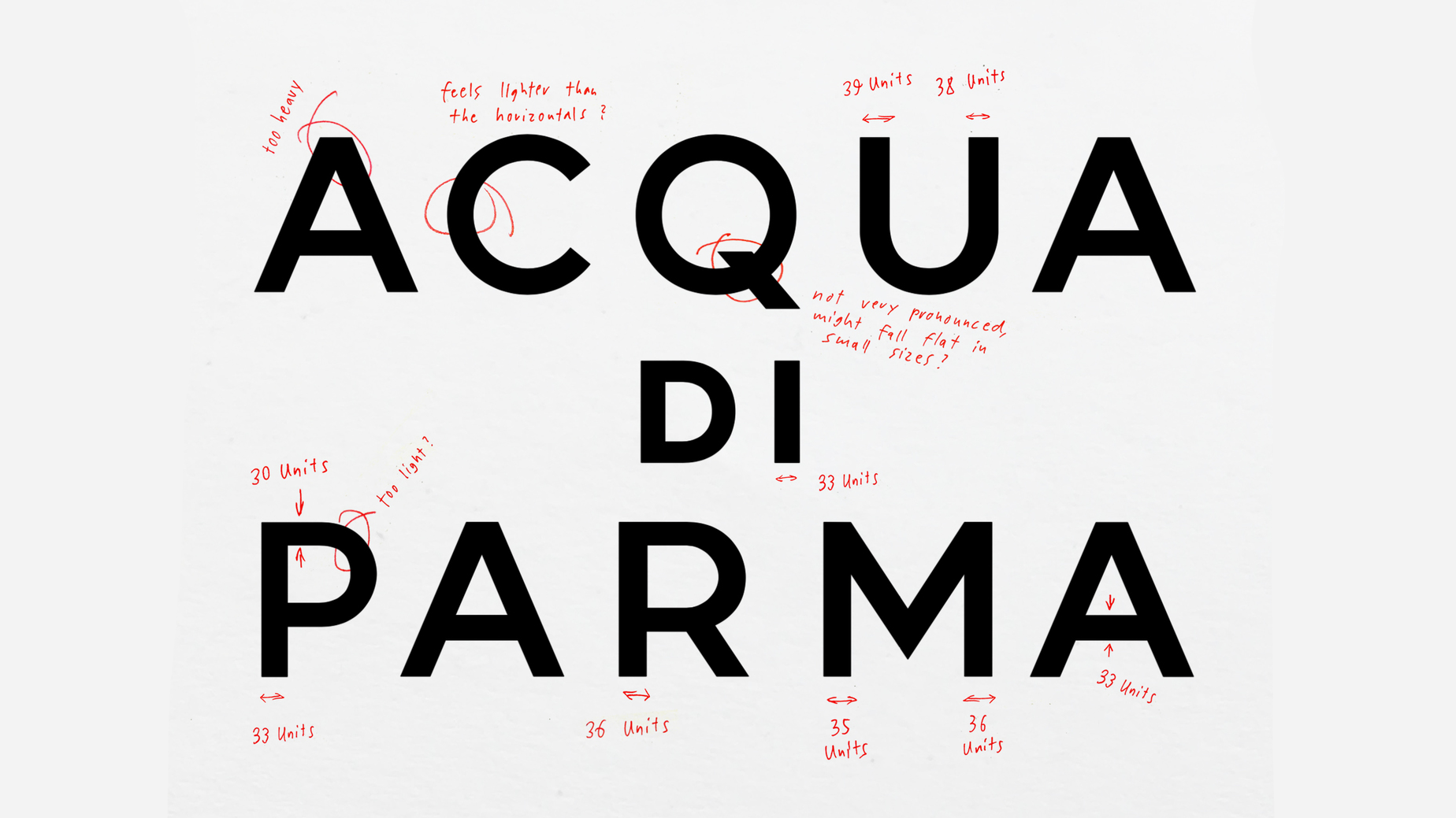
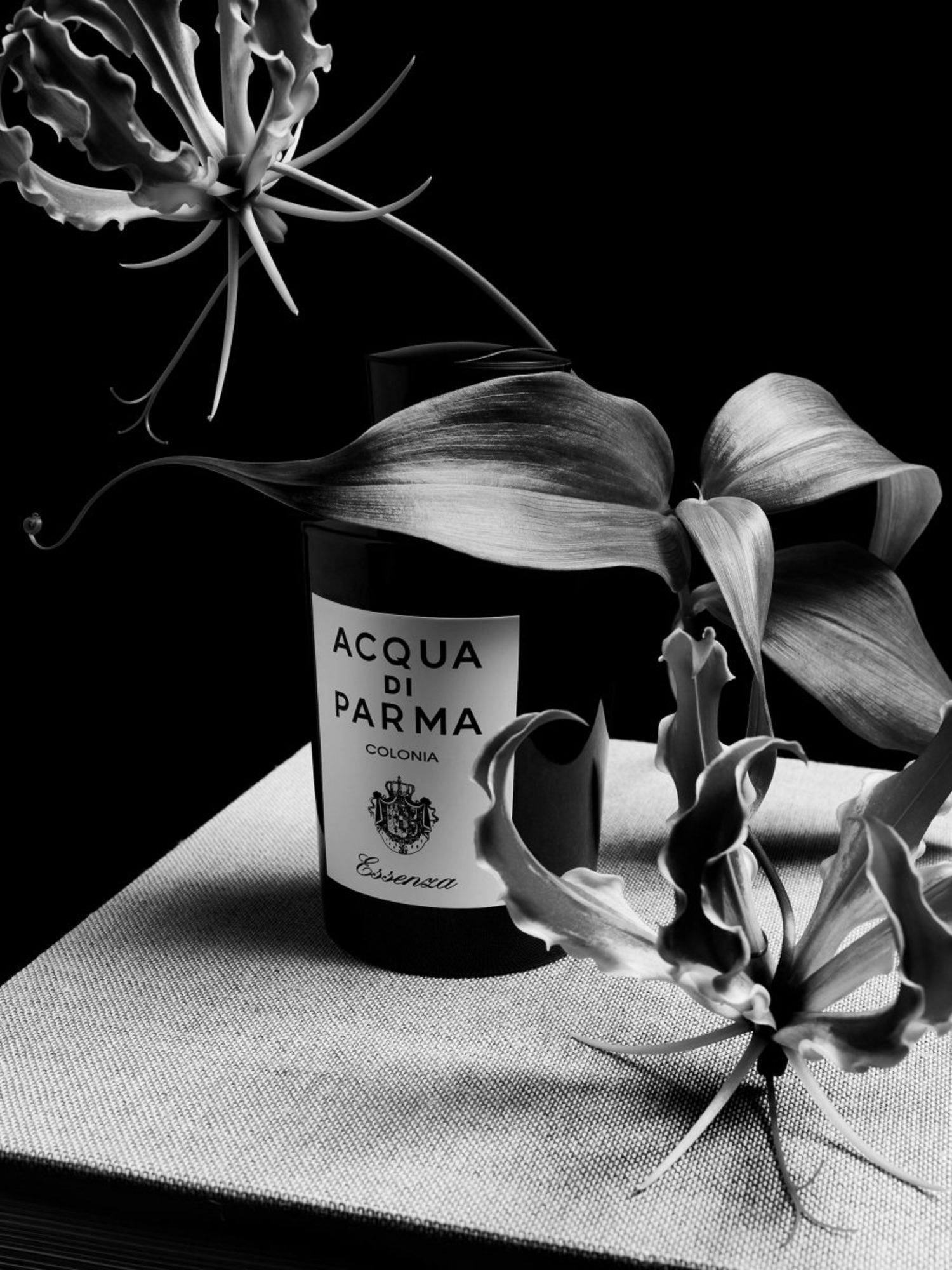
On behalf of Select World, ÉTÉ STUDIO had the honour of digitising the iconic logotype of Italian brand Acqua di Parma. Together with type foundry ABC Dinamo, a custom typeface was developed in two cuts—based on the brand’s distinctive lettering. In close collaboration with Creative Director Will Matthews, the overall visual aesthetic and look & feel of the brand were refined.
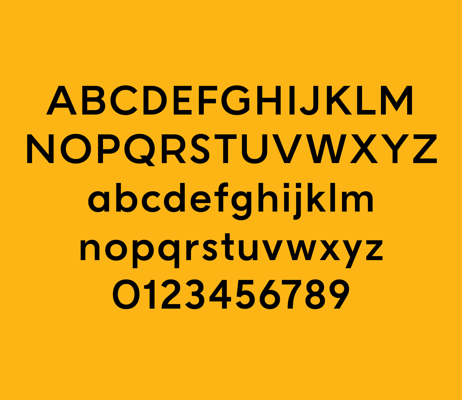
Bold weight
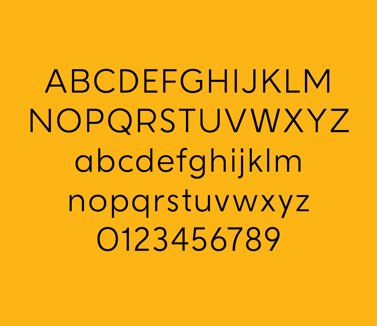
Light weight
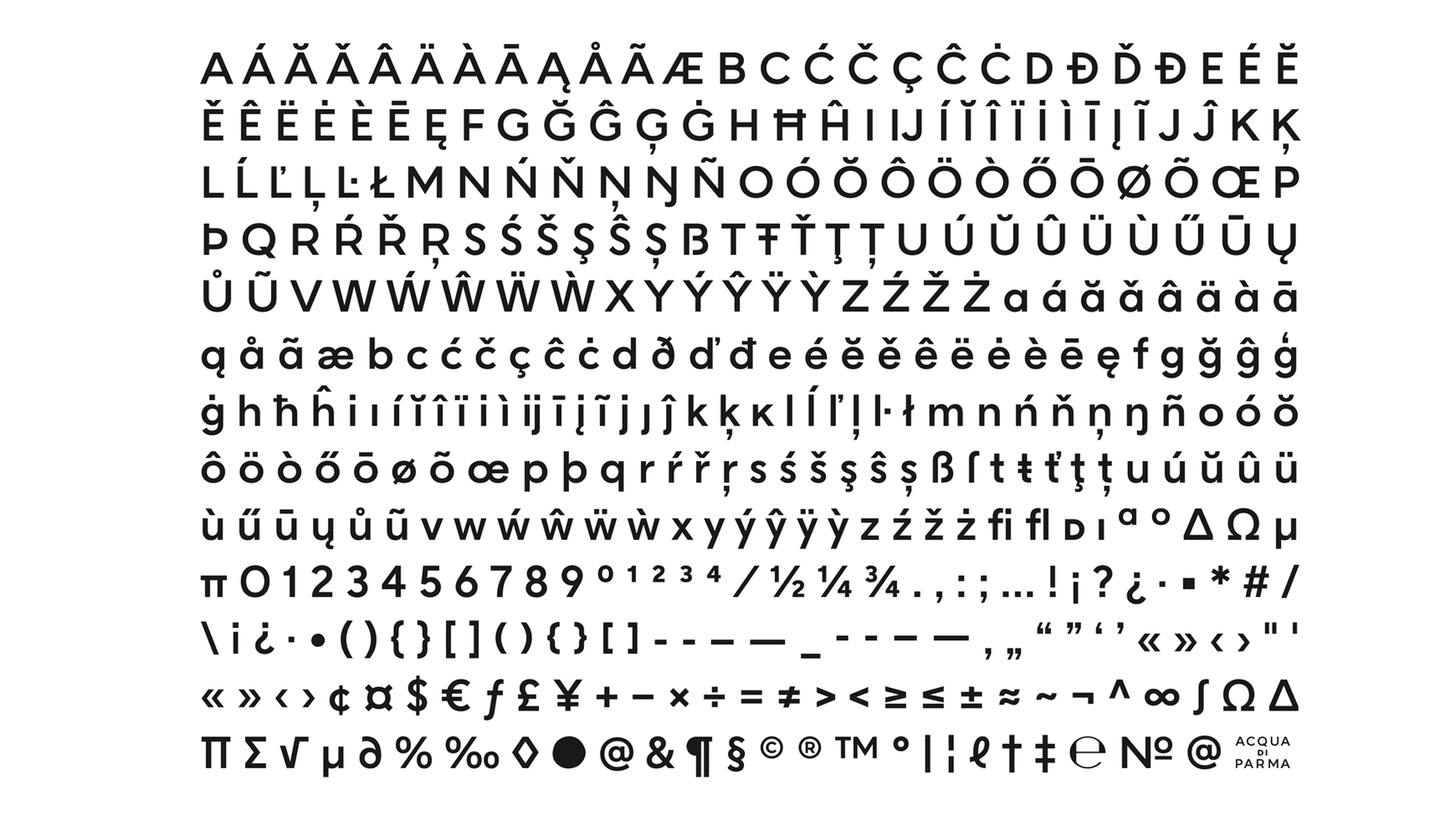
Transforming Acqua di Parma’s iconic logotype into a full sans serif typeface was no small task. The challenge lay in crafting something timeless and classical, while staying true to the character of the brand. As always, the devil is in the details.
Client
Acqua di Parma
Select World
ÉTÉ Team
Alexis Zurflüh (Art Direction)
Federico Bardelli (Graphic Design)
ABC Dinamo
Fabian Harb
Johannes Breyer
Work
WorkÉTÉ
Project
Genre
Grisebach
Art
NZZ am Sonntag Magazin
Editorial
Seekind Coffee
Coffee
Peek & Cloppenburg Campaigns
Fashion
Sparks & Visions Jazz Festival
Festival
Anson’s
Fashion
Süddeutsche Zeitung Magazin Stil Leben
Editorial
eponé Cosmetics
Beauty
Seoul Mediacity Biennale
Art
Sankt Leonhards Naturkosmetik
Beauty
JAKE*S
Fashion
Now Now Gallery
Art
VW Group Culture – Crossing
Editorial
Studio Soius
Architecture
Aqua Di Parma × ABC Dinamo
Typography
AMOO
Interior
Studio Mason
Jewellery
Midsummer Sculpture Festival
Festival
Philipp Junker
Fashion
MAY Ltd. International
Bicycles
Material Magazine
Editorial
BMW Foundation
Editorial
AK / Kruse
Art
